
QuanticMind · Predictive-advertising SaaS · 2016–2018
The question
How do you make an advertising platform intelligible when a client may manage many accounts and millions of keywords?
The work
QuanticMind had a sophisticated machine-learning platform, but its interface had been built without dedicated UX expertise. A client's advertising ecosystem ran through five nested levels: accounts, campaigns, ad groups, ads, and keywords. Some clients managed many accounts and millions of keywords across them. The hierarchy was difficult to navigate; labels, organization, and interaction behavior did not consistently explain what was happening.
I established a three-person design team: myself as leader, one colleague focused on information architecture and UX, and one focused on UI and visual design. I also initiated a systematic customer-feedback effort where the company previously had little direct conversation about the product experience. With a researcher and a product colleague, I led extensive interviews with customer organizations, meeting locally in person and speaking remotely with teams elsewhere in the world.
The judgment
The redesign needed to make the structure of the advertising work visible before it could make individual screens easier. We rebuilt the UI framework around clearer scope, language, and actions, using customer concerns alongside design principles and engineering constraints.
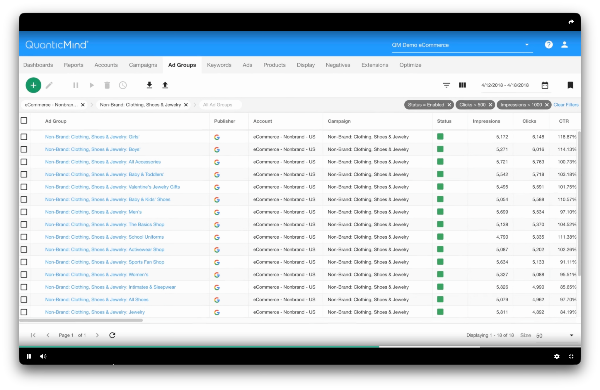
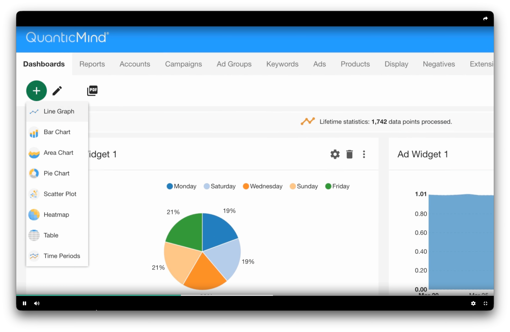
The delivered interface made several practical choices. Breadcrumbs showed where someone was within an account, campaign, or ad group. Reports exposed their filters, columns, schedule, and recipients in expandable details, while report templates offered a starting point for new dashboard widgets. Large tables kept active filters visible as removable chips; a filter builder and column controls let people narrow the data and choose the measures relevant to the task. Save, Save As, and Discard made the next action explicit. We simplified the visual treatment and used recognizable iconography and clearer labels throughout.
These are small decisions in isolation. Together they gave people a way to keep their place, inspect the basis of a view, and act on a manageable slice of a very large dataset. The combination mattered: a small team covered structure, interaction, and visual expression, while customer conversations kept the framework grounded in real work.
The result
The redesigned interface shipped and was received much more positively in customer conversations. Customers could make better sense of what was happening in their campaigns. I do not have a comparable pre/post usability or satisfaction measure to publish. A public investor report records a Search and Shopping interface update in the second quarter of 2018.
Contribution and result
| Field | Account |
|---|---|
| My contribution | Established and led the three-person team; initiated and led customer interviews with research and product partners; directed the interface-framework overhaul. |
| Observable consequence | Redesign shipped; customer conversations reported a substantially clearer experience. |
| Basis | Firsthand account of the interviews and reception; an archival interface walkthrough shows the patterns; public records corroborate my role and an interface update. |
| Boundary | The public record does not independently establish the precise design contribution or quantify customer or commercial effects. |
Public record
Company announcement naming the UX leadership role
Investor report recording the interface update
What I carry forward
An advanced engine becomes a useful product only when people can understand the structure of their work and the choices available to them.
Project descriptions focus on my role and the contribution I can describe publicly. Confidential materials are omitted. Illustrations identified as reconstructions explain an idea; they are not original project deliverables.